Exploring the result...
In the last section, we passed DAVID a list of IDs. These IDs have then been passed on to a number of different systems (far too many to list here) for further analysis.
What has been demonstrated here is a very complex 'workflow', it has taken our IDs and then used them to search a range of other tools, and to do 'clustering of terms'.
We are now going to explore some of those findings. However, there is so much analysis here that we can't possibly cover all of it during this training session. It is up to you to explore and find some of the other interesting results.
We are going to start by looking at 'Functional Clustering Analysis'.
Functional Clustering Analysis will, by the use of looking for enrichment in ontology terms associated with the IDs, present a list grouping the genes by biological function.
- Click on the button labelled 'Functional Annotation Clustering'.
You should now have a screen that looks like the image below.

Cluster of genes - Monday November 12, 2018 at 7:09:41 pm
Below is an image taken from the
DAVID website
that explains the clustering:
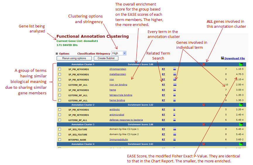
Image from DAVID - https://david.ncifcrf.gov/helps/functional_annotation.html#E4
If you look at your analysis (the image above), you will see the clustering of genes based on their biological function.
We will now begin to explore the data a little deeper...
- Click on the green smudgy thing (see image below) - for some reason this may not work for annotation 1, so use annotation 2 as shown in the image below.
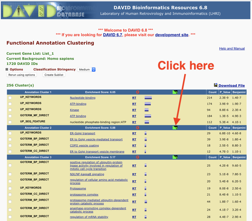
Click the green thing - results from Monday November 12, 2018 at 7:13:06 pm
You should now be looking at a heat map, which gives you a better overview of the data for that particular annotation.
- Scroll up and down the page, and look at the names of the genes on the right-hand side of the heat map, and the terms listed along the bottom.
Below is a heat map from one of the annotations.
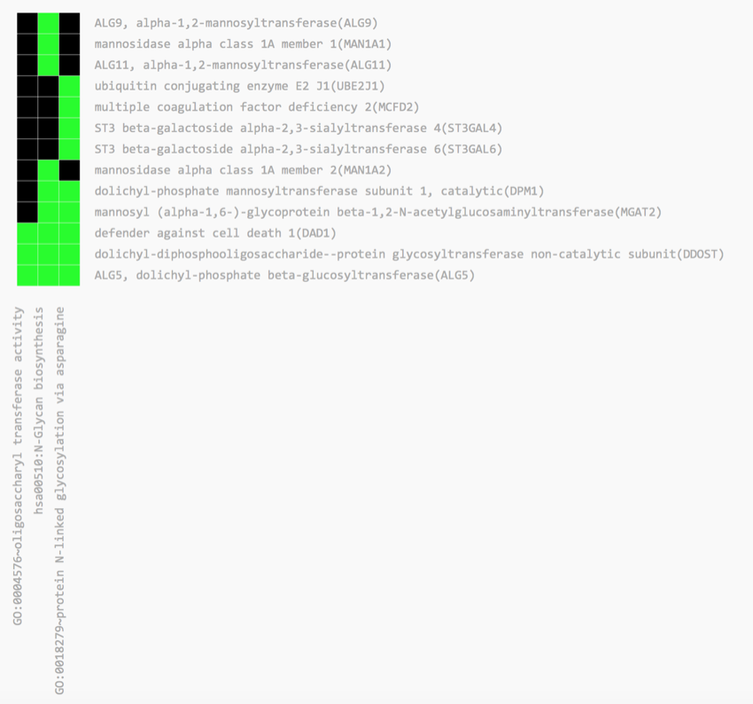
Heat map
The key thing to note is the green squares, which indicate a match between the gene and the term. We have the gene names down the right-hand side and the associated ontology terms along the bottom.
Take some time to explore the heat maps.
You may also wish to rerun the analysis using a higher 'Classification Stringency'. Set the 'Classification Stringency' too 'Highest', and then click the 'Rerun using options' button. Did anything change?
Also, take some time to explore the other links on the page. Can you draw any conclusions about the impact of diabetes on gene expression in islets?
We are now going to look at the Functional Annotation Chart.
- Return the DAVID results page and click on the 'Functional Annotation Chart' button.
Click on the Functional Annotation Chart button
You should now be looking at something like this:
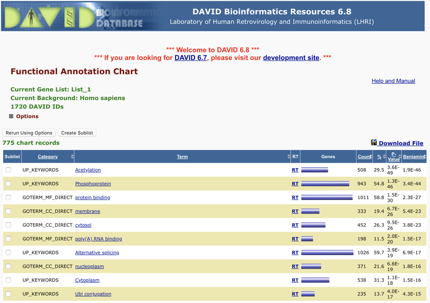
The DAVID Functional Annotation Chart report - Monday November 12, 2018 at 7:18:09 pm
Below is an explanation of the page you are looking at, this was taken from the help section at
DAVID
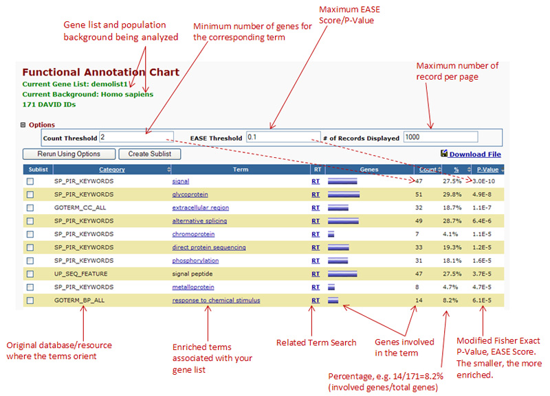
Explanaition of the functional chart report - taken from https://david.ncifcrf.gov/helps/functional_annotation.html#E3
Your results are initially presented in ascending order of P value. You can change the order by clicking on the various headings.
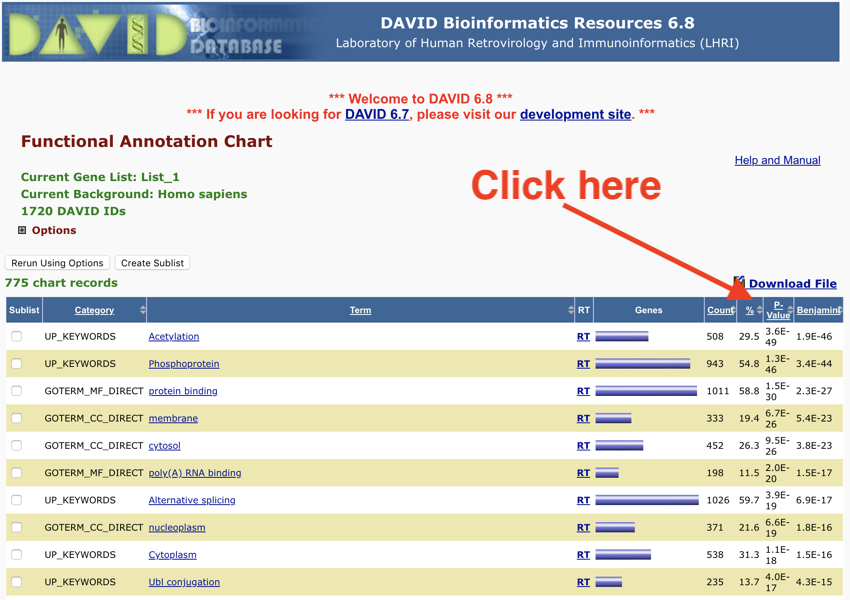
Sort by percentage
Again, take your time to explore the list and click on the various links.
Next, we will look at some of the other information on the page.
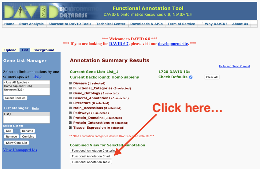
Back on the main DAVID page (the one you were clicking buttons on), above the section with the buttons, there is a list of searches that have been carried out. These searches can be worth exploring as they will give you further insight into the dataset.
- Return to the main DAVID page.
Let's work through some of the other searches and analysis that has been carried out.
Let's look at diseases...
- Click on 'Disease' to open the menu.

The DAVID diseases
You can now see the databases that we used to carry out the analysis. Recognise the name of any of them?
- Click on any of the 'Chart' buttons.
You should now be looking at the table of 'diseases' associated with this dataset. The table is very similar to the one you saw earlier, that is, it can be sorted by different values. Spend some time exploring the table.
I'm a sucker for pathways! During my career, I've worked on metabolic and signalling pathways, so naturally, I'm drawn to this section of the analysis.
One of my favourite pathway annotation tools is KEGG, and DAVID has this as part of its analysis system.
- Click on the 'Pathways' heading on the main DAVID page.
- Next, click on the 'Chart' button next to the 'KEGG' entry.
- Sort the table by p-value; it should look like the image below
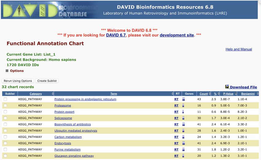
Sorted by p value - Monday November 12, 2018 at 7:27:36 pm
- Next, click on the top link, it should be 'Protein processing in endoplasmic reticulum'.
- Review the information on the next page that opens.
I think that is amazing. While doing some research a few years ago I spent days annotating a metabolic chart trying to find the proteins that had changed. Now you can do it with a click of a mouse. However, you still have still got to work out what it all means!
- Re-sort the table by count, so that the highest count is at the top.
You should find that the top item is still 'Protein processing in endoplasmic reticulum'.
- Click on the second or third item down 'Endocytosis'.
- Review the data.
Again, in my view, fantastic.
We are now going to look at protein domains.
- Go to the 'Protein Domains' section on the main DAVID results page.
- Open it.
- Click on the 'Chart' button next to SMART
 .
.
You should now have a list of
SMART protein domains open. The list is initially sorted by P-value. However, you may wish to change this to 'Count'.
What is interesting here is that we are looking at the frequency of domains in the proteins of the genes of interest. This information may give you some insight into the underlying cause or problem with the disease.
What amazes me here is that I used to do
SMART searches by hand for a group of proteins and then play 'spot the common domain', and yet here it's all done for you.
Take some time to explore the other entries in the list.
Wow! We have covered a lot in this section. So much, that your mind is most probably spinning.
We have looked at:
- Functional Clustering Analysis
- Heatmaps
- Functional Annotation Chart
- Diseases
- Pathways
- Protein Domains
and we looked at how to explore the data.
Yes, there is no 'complete' or 'correct' definitive answer.
You now have the data, the data has been analysed and sorted, it has been grouped and annotated, and now you have to use your 'biological knowledge' to explore the data further. Your aim may be to identify potential new drug targets, to gain insight into how the disease comes about, how symptoms are caused, and/or what is the underlying mechanism for the condition.
Don't forget, you can use the tools we covered earlier, the Microsoft Teams tools and the OneNote text clipper, to grab the data as we gather it so you have a record, that you can then review and add to as you explore the data.
Without tools such as DAVID trying to do the analysis you have carried out in this session would be impossible. We were dealing with nearly 2000 gene identifiers that showed differences between the diabetic and nondiabetic islet cells. How could you possibly make sense of all that data without bioinformatics tools?
You may have noticed in the above that we were working with Affymetrix gene IDs, and yet some of the data coming back had different IDs associated with the sequences or the database entries.
In the next section were going to look at moving between dataset IDS. This is a re-occurring problem in bioinformatics.